.webp?width=12693&height=4513&name=Sauce%20Logo%20Dark%20Ht%20(1).webp "Sauce logo")

.webp?width=180&height=64&name=Sauce%20Logo%20Dark%20Ht%20(1).webp "Sauce logo")

Accessibility is the smartest business decision you can make for your brand.
Why? You should be asking yourself why not?! It’s just the right thing to do. Over 60 million adults in the United States have a disability that impacts some aspect of their life. I’d wager at least a handful of those kind folks are active or prospective customers of your business.
The entrance to your physical business is accessible, and your brand should be too. Your customers want a brand that is inclusive and accessible, and since you’re reading this blog, I know you do too.
Over the next few minutes, I invite you to read several simple ways you can shift your brand from unaware and concerned to accessible and inviting.
Section 1: Copy
Structure your website copy with headlines and titles
Want to make sure your message is clear? Be intentional about how you structure your copy. Walls of text can be difficult to read and cause your audience to bounce, or give up before reading your message. Structuring your blogs with descriptive heads that group content and sections result in a pleasant reading experience for your visitors.
An important note about headers: be consistent with your header size! Proper structure is ideal, but consistency is the glue that holds it all together. Always double-check your header size.
Besides accessibility, headlines and titles are also good for SEO.
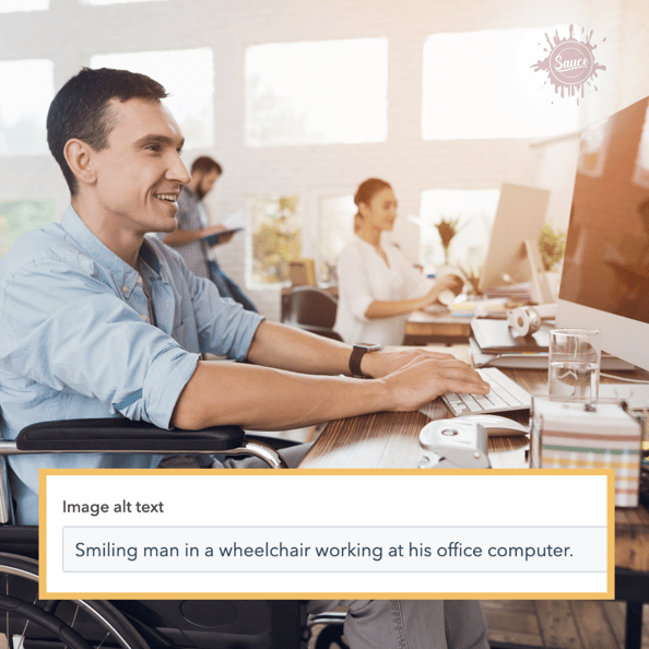
Alternative text for pages, media, and posts
Image alt-text is as necessary for your website visitors as it is for search engine optimization. If a visually impaired visitor uses a screen reader to browse your website, alt-text describes images. If a prospective customer browses for your products, alt-text helps search engines rank your website. A higher-ranking website means more traffic and sales.
Each social media platform offers different approaches to accessibility. Some are doing a much better job than others. The University of South Carolina compiled a list identifying social media accessibility options. Click here to read a USC blog about applying alt text to new and existing social media posts.
Write better links and hashtags
Write links that clarify where they lead. Instead of 'click here,' type 'click here to read my blog.' Communicating action and location creates an accessible link for every reader.
Consider this: the shorter the link, the less space a finger has to click. If a visitor is motor or visually impaired, longer links mean an easy user experience.
If you use hashtags in your copy, write out tags in camel case. What is camel case? Here is a quick example:
- This is a Sauce Agency example of what not to do: #growsmarter
- This is the correct way to write out a hashtag in camel case: #GrowSmarter
Notice the difference? Since each word is capitalized, a hashtag written in camel case is clearer and simpler to read. Plus, screen readers have an easier time reading the hashtags.
One final hashtag tip: place your hashtags at the end of a social post. Think about it: do you like reading hashtags in the middle of an important update? No. Screen readers read out entire hashtags and sometimes have trouble deciphering the words. Instead of peppering hashtags throughout your marketing copy, place them at the end of your posts.
Write simpler
Remember: when you confuse, you lose. Your brand voice must speak to everyone, no matter what. Don't try to be clever with key information. Be clear, be simple, be direct. A simple message means more customers, more revenue, and a better customer experience for everyone.
Our production team at Sauce Agency use three tools to write simpler. These tools are industry-standard services that offer free or paid options:
- Grammar.ly: Identifies grammatical issues and spelling errors other programs miss
- Grades your writing based on four factors: correctness, clarity, engagement, delivery
- Offers a free desktop or browser client to draft, edit, and correct copy
- Download a free browser extension to monitor writing in real-time
- Provides goal-setting for tone, voice, and intent
- Learn more about Grammar.ly on their website
- Hemingway Editor: A fantastic resource that simplifies sentence structure and assigns a reading level to your copy. The goal for accessible, simple copy is 8th grade or lower. Learn more about Hemingway Editor on their website.
- Microsoft Office accessibility checker: Microsoft offers a tool to identify and correct accessibility issues in Microsoft Office suite. Whether your designing a PowerPoint or drafting an email in Outlook, the accessibility checker tells you what is wrong and the steps to fix it. Read about the accessibility checker on Microsoft's website here.
Section 2: Design
Design for colorblind, low-vision, and blind visitors
Do not use color to convey primary information. Instead, use color to accent and improve primary information. When you use color to communicate essential information, such as correct or incorrect user feedback, you alienate colorblind visitors. Ensure all necessary and relevant information is accessible to everyone, even those who cannot perceive color.
For low-vision website visitors or social media followers, contrast is vital. Use high contrast for as many assets as you can. The minimum contrast ratio for website design and social media text and graphics is 3:1. We’ve provided some handy reference links below, including a contrast checker!
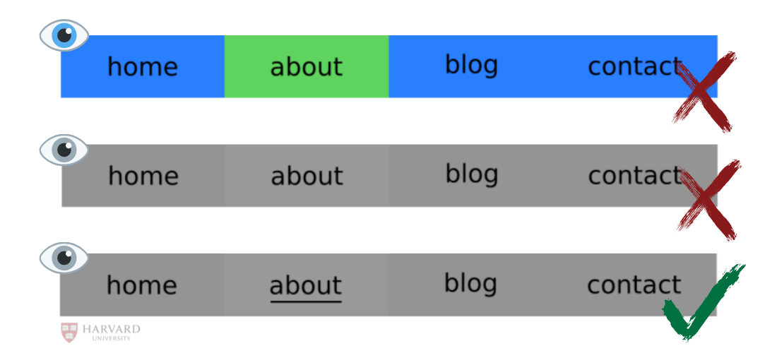
Designing for blind website visitors is tough— but it's not impossible. Here are two great ways to build navigation for blind visitors:
You can adapt your navigation bars to be accessible for colorblind, low vision and blind visitors in one swoop: indicate current page location. Instead of using contrasting colors to convey navigation, use contrasting shades and bold underlining.
To indicate navigation for blind visitors, add website code visible only to screen readers. This is a great way to communicate placement and navigation for blind and low-vision visitors. For information and coding examples, read this tutorial from Harvard.
Here are five invaluable resources to design for disability:
- Contrast Checker works as advertised. Upload your image, identify issues, find solutions. Contrast Checker is a free, simple tool that improves design accessibility for social media website graphics. Use Contrast Checker today by clicking this link.
- ColorSafe follows WGAG guidelines to build an accessible color palette for your text and background contrast. All you need to do is enter a color, choose your font, and generate your palette. Click here to build an accessible design with ColorSafe
- Digital Accessibility at Harvard University is the pinnacle of accessibility design guidance, training, and examples. With tailored guides for designers, educators, and creators, Harvard aims to build an accessible digital resource for everyone. You will learn nearly everything there is to know about designing for disability. All you need to do is click this link.
- UserWay is an automated website accessibility tool that is WCAG 2.1 and ADA compliant. We use it here at Sauce Agency. Click here to test UserWay on our homepage or visit UserWay’s website for more information.
- Color Oracle is a free, open-source color blindness simulator for most operating systems. This software takes the guesswork out of designing for disability by showing you in real-time what people with common visual impairments see. Visit the color oracle website to test your designs.
Empty form labeling
Forms are everywhere nowadays. If you think browsing the web is frustrating, stop and think how frustrating all of those forms and pop-ups are for a user with motor or visual impairments. We understand forms are essential for capturing leads and driving long-term engagement. But that doesn’t mean you gloss over designing forms without accessibility in mind..png?width=1080&name=Blog%20example%20-%20alt%20text%20(1).png) All forms must have a clear label and border. Instead of a blank form with grey text, label a form with a description and directions above the form. Clear labels and borders help visual, motor, and cognitively impaired visitors to understand your forms.
All forms must have a clear label and border. Instead of a blank form with grey text, label a form with a description and directions above the form. Clear labels and borders help visual, motor, and cognitively impaired visitors to understand your forms.
This information bears repeating: Do not communicate primary form information with color! Do not use color to indicate if a form entry or submission is successful or needs correction.
Minimize or eliminate hovering
Hovering over navigation menus is frustrating for everyone. When was the last time you successfully navigated a hovering navigation menu on a touchscreen? While it’s frustrating for people without disabilities, it’s downright impossible to deal with if you have a motor disability. Be mindful of excessive hovering implementation on your navigation and browsing. In fact, it’s best to eliminate hovering from your website entirely.
Section 3: Video
Captions
Auto-generated or manual captions are essential for your brand’s video content. Screen readers rely on video captions for low vision and blind viewers. Captions are fantastic additions to any brand. Here are two common issues regarding captions:
- AI-driven, auto-generated captions are better than nothing. Expect errors and minor issues, which might lead to confusion and lost sales.
- Manual captions are written by your business or by a third party. There is a lower chance for confusion and more opportunity for caption placement, appearance, and caption content. This option is better for accessibility but time-consuming.
Most social media giants offer auto-generated caption features or the ability to upload an SRT file with your content. For more information on SRT files, visit a blog about SRT’s from HubSpot.
Captioning your videos is an essential step in creating and maintaining an accessible brand for all of your customers. If you do not have the time to script your videos, auto-generating is the next best option.
Here are several resources to learn more about captions on your preferred social platform:
- Facebook offers both auto-generated captions and manual captions. Click here to learn more from Facebook’s help center.
- Instagram, also owned by Facebook, is slowly adding captions to its content. As of May 2021, brands have the option to add caption stickers to a story. Here is a breakdown of that new feature from the Verge. At this time, there are no options to add contrast to story captions.
- Google offers both auto-captioning and manual transcription for YouTube videos. Visit YouTube Help for more information. Click here for auto-generated captions. Click here to learn about adding manual captions.
- Since 2019, Twitter offers the option to upload an SRT file with any uploaded video content. Read more about video captioning from Twitter’s media desk.
- Clipomatic is a free-to-use app that automatically generates video captions in real-time. All you need to do is open the app, press record, and generate captions. Learn more on the Clipomatic website.
Media players
Your media player is more important than your content. Remember: the crux of your brand is the user experience and satisfaction. If your media player auto-plays, or fails to respond to keyboard commands, it is not accessible. Here is a checklist to determine whether your media player is accessible for all:
- Make sure your video player plays only in response to user action
- Do video controls respond to standard keyboard commands?
- Does each control have a descriptive name? For example, do the play and pause buttons communicate whether the video is playing or paused?
- Can captions be toggled?
If your media player fails to address these questions, stop making content, address these concerns, and use an accessible media player for all of your customers.
For more information from the experts, visit the Web Accessibility Initiative website and Deque University’s tips for media player controls.
Ban flashing from your video content
Flashing lights are life-threatening to viewers with photosensitive viewing disorders. Blinking, or slower bursts of light, distract everyone and are concerning to the same photosensitive audience. Blinking, however, is not life-threatening. Flashing is faster and usually occurs more than three times a second. This rate will trigger a seizure.
The world is better at reducing and removing flashing in videos than it used to be. It is still not good enough. Unless entirely unavoidable, remove seizure-inducing flashing from your videos. If absolutely necessary — there are few instances where that is true — be as proactive as possible. Add flash warnings to your titles, descriptions, captions, and video. Warning labels at every single viewing touchpoint show you are aware of accessibility and working to be compliant and considerate. Avoiding flashing is the safest, most accessible option for video content.
Including flashing in your videos is not worth it. For an exhaustive overview of recommendations for flashing and blinking media, visit W3C’s Web Content Accessibility guidelines here.
Accessibility action steps
This blog is not a comprehensive list of accessibility options for your brand. The resources throughout this blog have far more information and expertise than we do. We all start somewhere. The best accessibility steps you can take are to stay informed and to challenge your existing habits to find problems you can correct.
Every brand, including Sauce Agency, struggles to build an accessible, inclusive space for everyone. Searching for accessibility options and tips shows you are on the right path. You are one step closer to a better brand experience for your customers living with disabilities.
Here are four steps you can do right now to make your brand more accessible:
- Read through this blog again and select five resources.
- Cross-reference help and guidance from the resources with your social media and website.
- Create five clear action steps to make your brand more accessible.
- Apply changes and revisit your brand accessibility each fiscal quarter.
We want to hear from you about your brand accessibility. Interested but struggling to keep up with new ways to build accessible brands? Learn more about brand accessibility by scheduling a call with a certified Growth Guide today.