Web Design Trends for 2020 & Beyond
We’re half-way through 2020 and if you haven’t refreshed your website for the new century, you’re likely missing out on web design’s latest, most exciting trends. There are trends to follow in every industry, the fashion industry being the most notable, but none seem to reinvent themselves quite like the web design industry does. This is in part due to the youngness of the online world and the speed at which the industry is growing every year. New technologies and different ways to do things are released consistently, influencing the way web design reinvents itself to keep up.
Do you remember the first iteration of Google’s search engine? If you don’t remember (or weren’t born yet), here’s the popular search engine throughout the years:
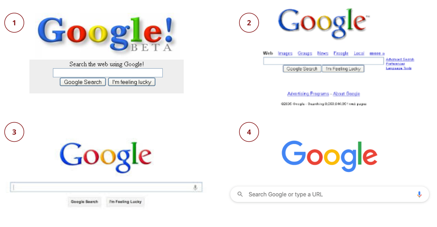
Google has constantly updated its look through the years leading up to its current iteration and cleanest yet. If they had kept the same look as Google Beta, would that have changed what search engine you used today? Statistically, the answer is yes. It takes about 50 milliseconds (that’s 0.05 seconds) for users to form an opinion about your website.
Modern day users put their trust in companies who keep up with modern technology and website design trends. Updating their website design to modern standards makes for greater user experience, follows Growth-Driven Design best practices, and lets the user know that the company is constantly improving and innovating, which will benefit them in the long run. This means keeping up with the latest and best design trends will benefit the company who is naturally looking to attract their target audience.
So, what are these latest trends that you’ll be seeing a lot of while browsing the web this year? Here are some of the most popular web designs that will dominate the digital space.
Light & Dark
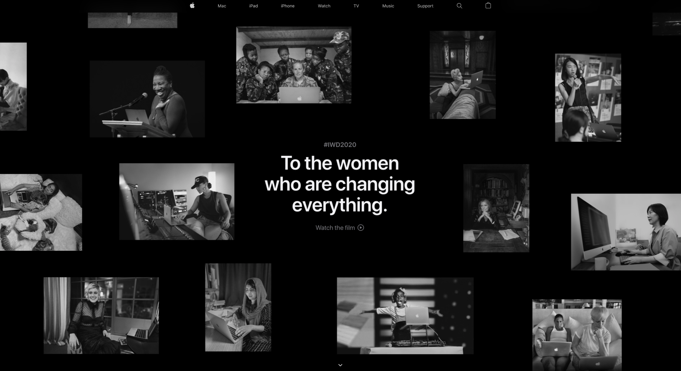
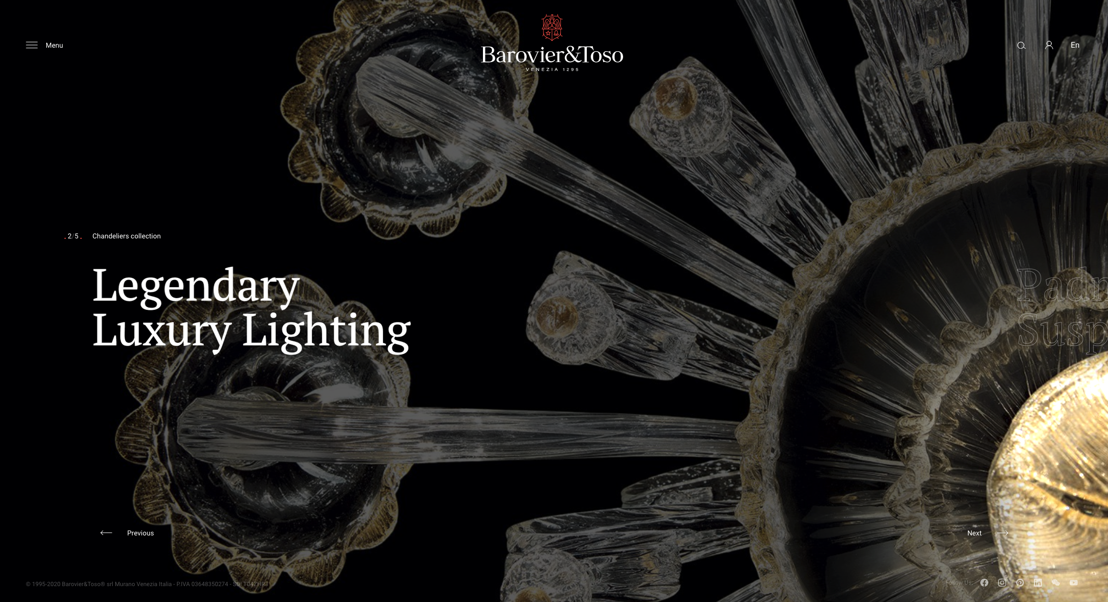
With many apps, search engines, and social media conglomerates opting to include a dark mode option for their users, it’s no surprise that web design is following in their footsteps. Having a dark mode was introduced by Google in apps like YouTube in 2019 in order to reduce eye strain while viewing a website in a dark room or at night. You may only have come across this feature on your phone in certain apps, but around the same time, Chrome also implemented a feature called Night Eye. In this browser mode, users can turn it on and browse any site in a forced dark mode whether the website is optimized for it or not. This becomes problematic when sites that are not optimized for dark mode; even the most well designed sites don’t look their best.
Luminous Colors & Modern Gradients
The internet is flooded with websites and with many of them being well designed and aesthetically pleasing, it can take a lot for a company to stand out in the crowd. One way you can make your website stand out now and for years to come is by incorporating bold, bright colors. With screen resolutions — especially on phones — constantly improving, bright colors will pop and help your site make a statement. Bright and saturated colors paired with deep, rich hues pop on the page and make a statement. A splash of color guides your readers to products for sale or other important info.
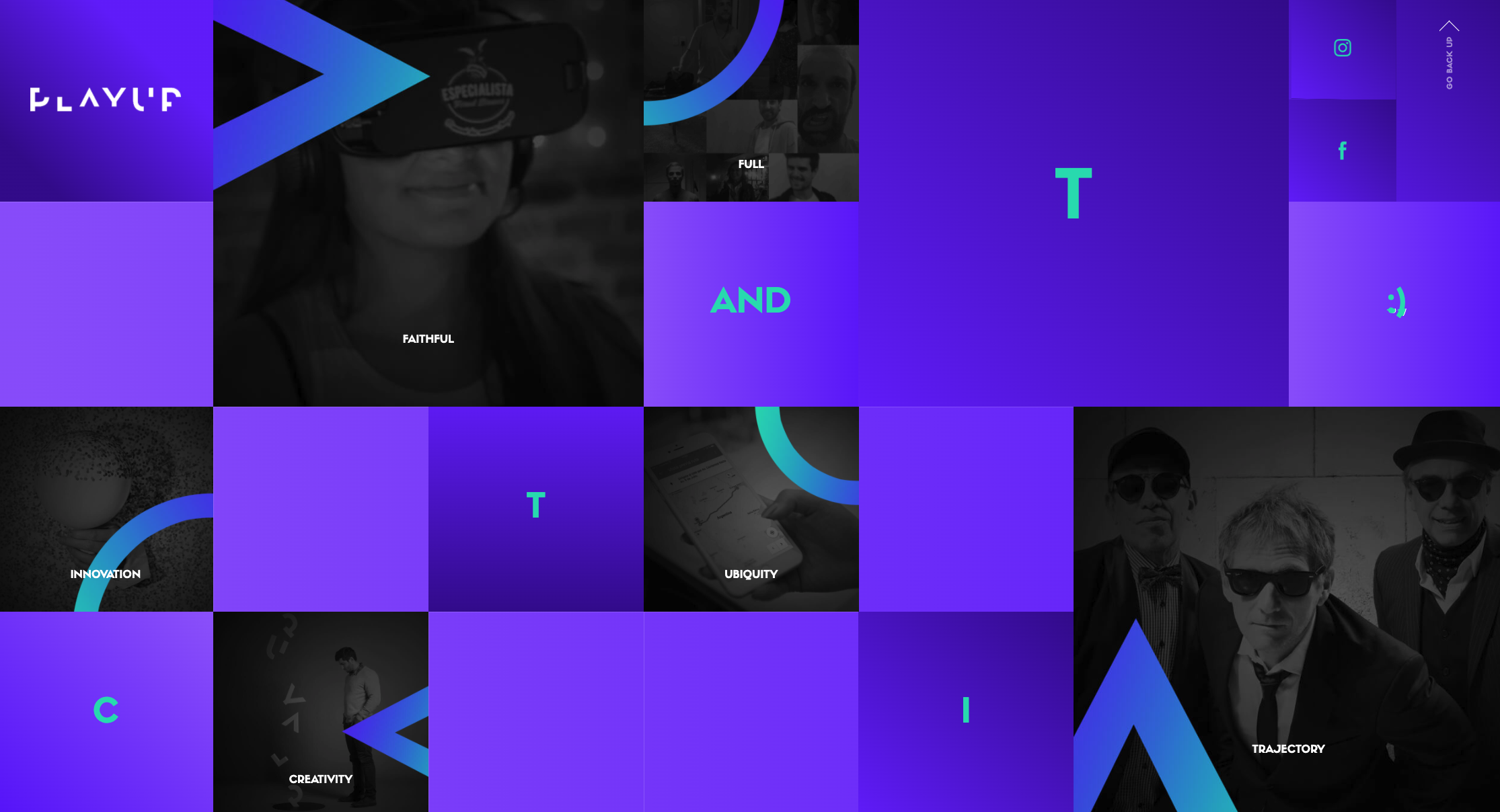
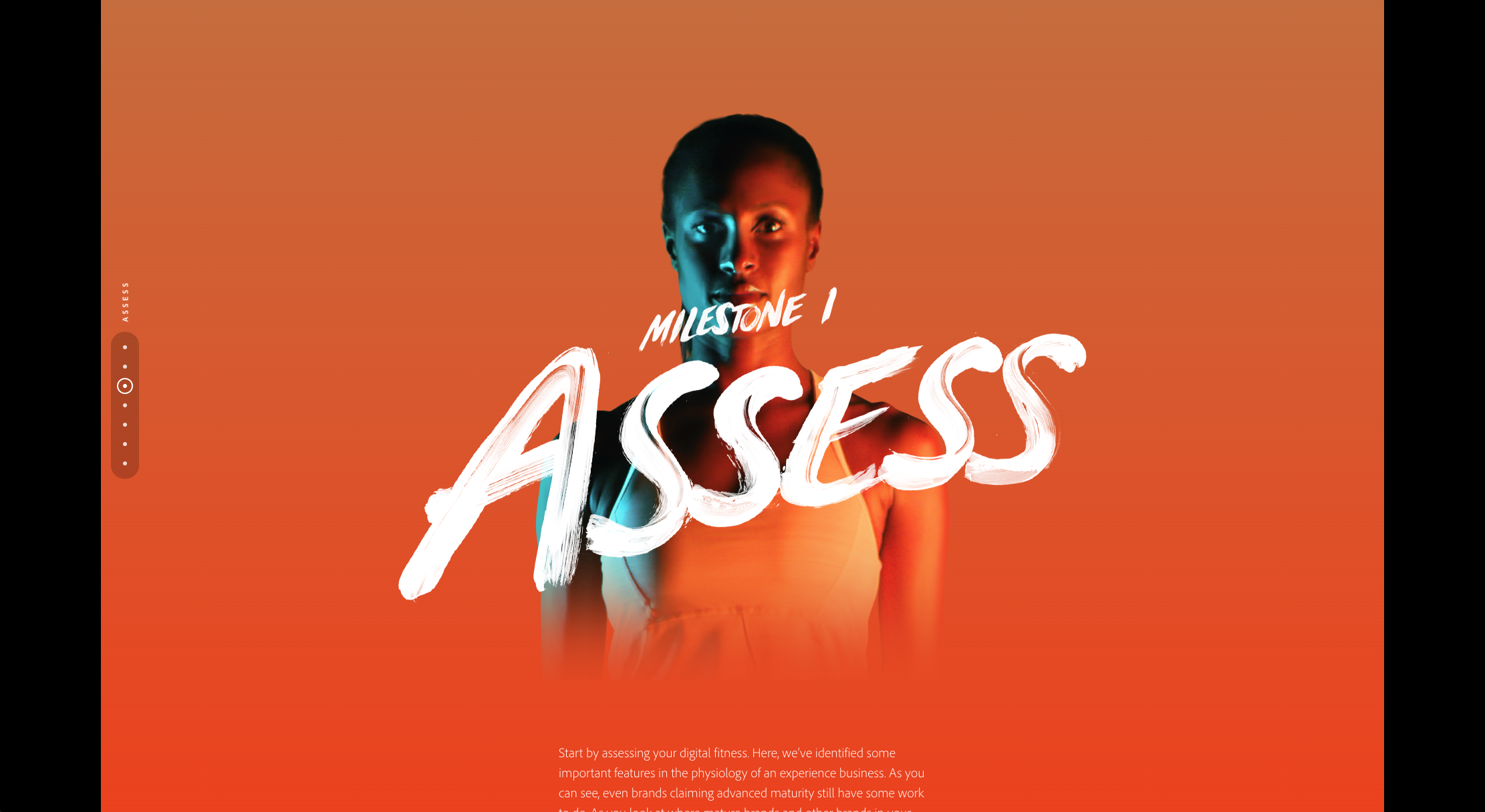
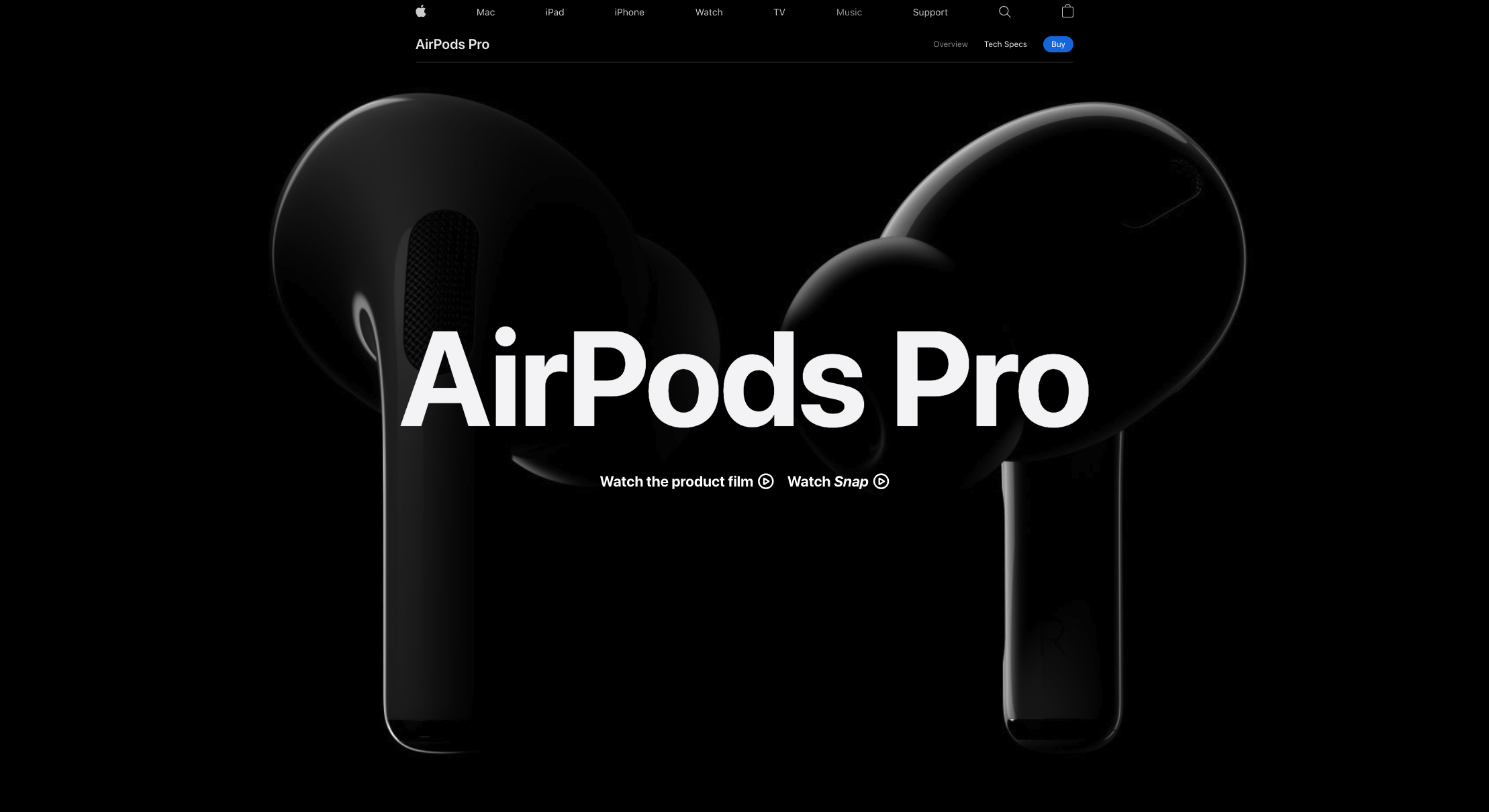
A popular use of color and major trend in 2020 is the use of luminous, glowing, or neon colors. The popularity of these colors has grown with the popularity of dark mode and darker websites. Pops of neon and glow-in-the-dark colors stand out against dark backgrounds and make them seem as if they are coming out of the screen.
Gradients have been popular for many years, but are consistently re-invented. In 2020 they’ve been given new life. Gone are the monotone and muted colors blending seamlessly together. With bright, saturated colors popping up, brightly-colored gradients with contrasting colors easily fit into the digital landscape.
Minimalist & Streamlined
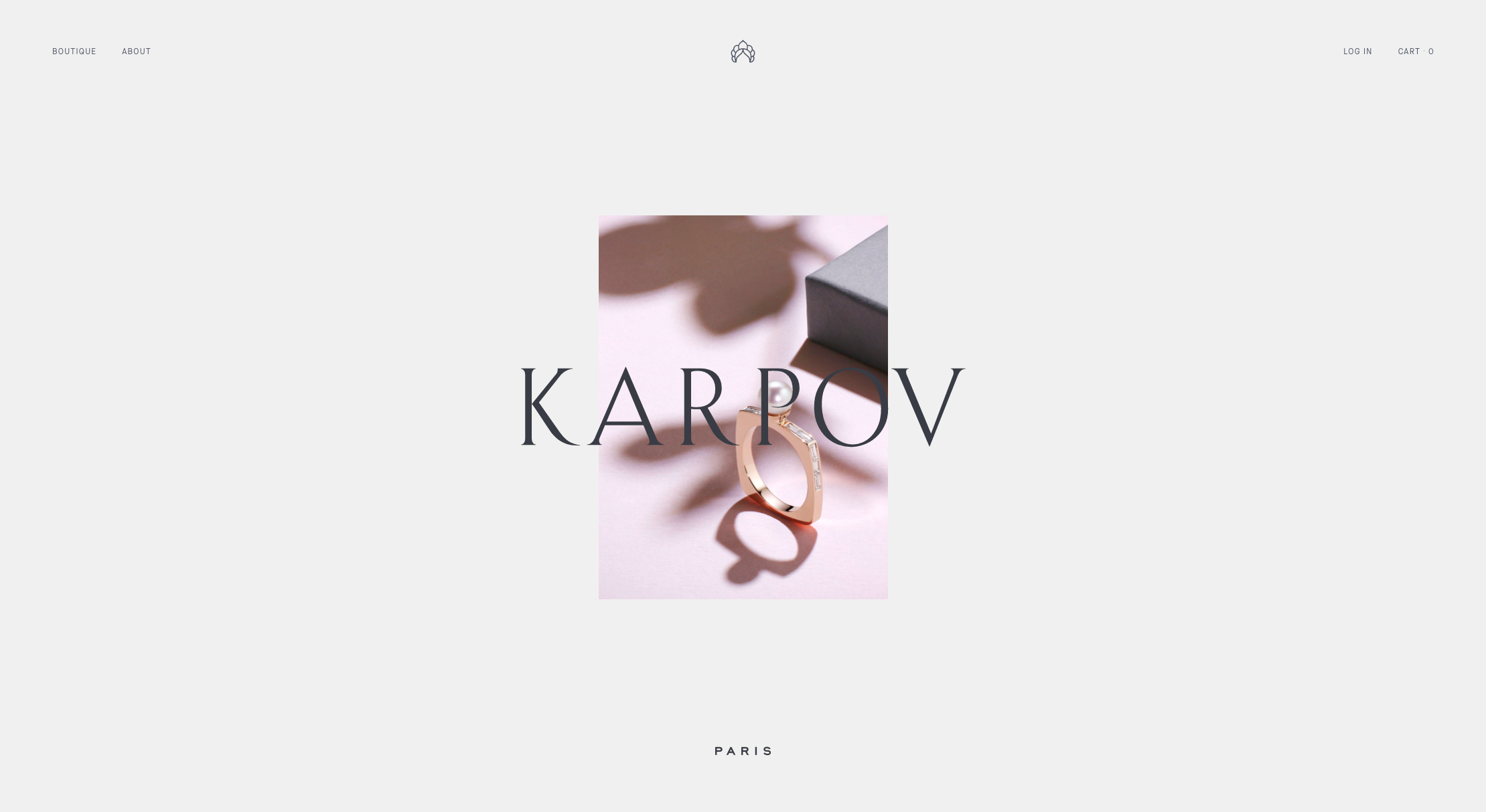
A continued focus on minimalist design should come to no surprise. Websites have slowly been evolving to be more and more minimal in design over time. In the early to mid 2000s, block color and flat design were very popular, then later on, full-width photography. Now, with the rise and importance of mobile design, designers are opting for a more minimalistic approach.
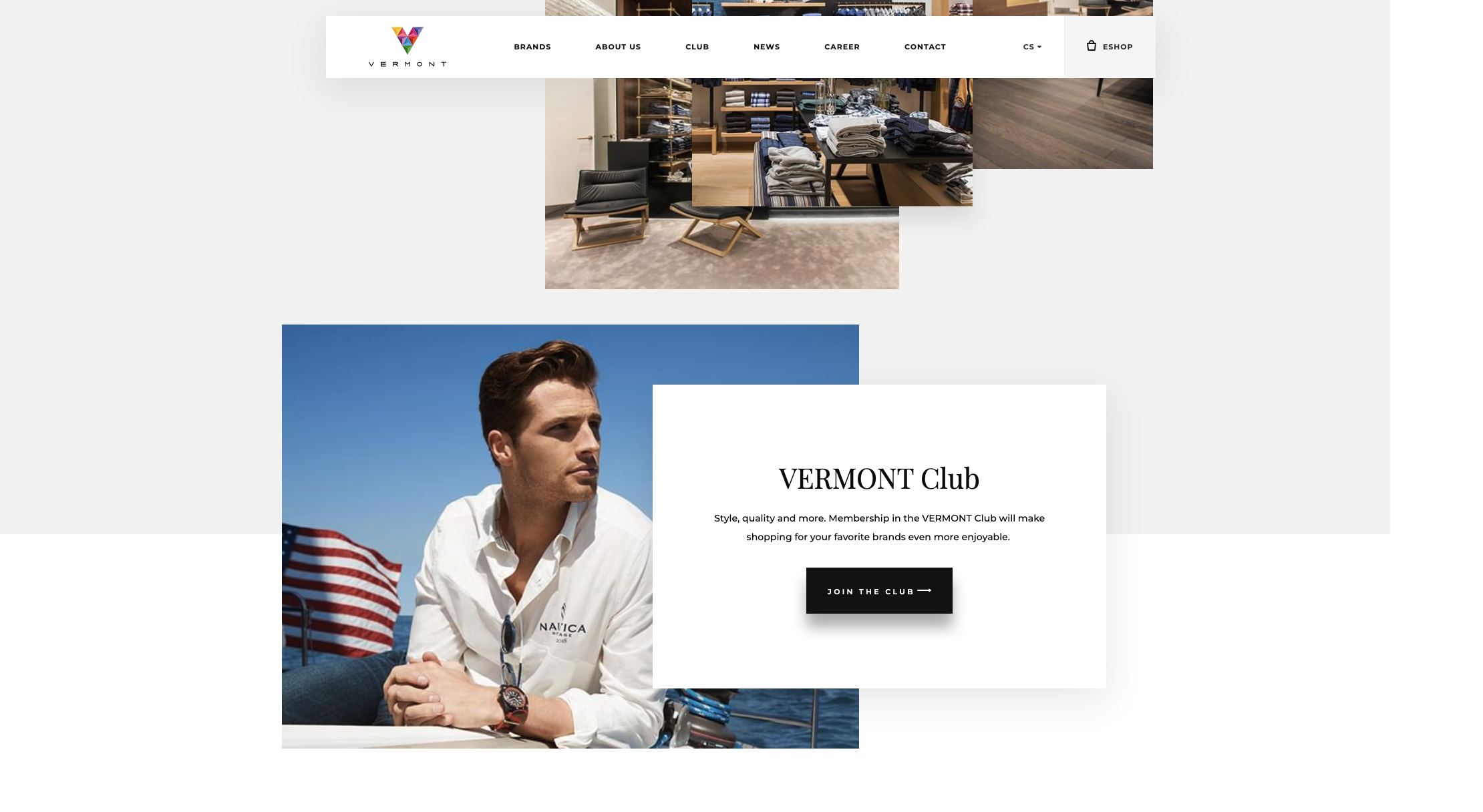
Minimal design doesn’t have to mean plain design though. Minimalistic designs can still include bright colors and bold typography as well as depth created by overlapping elements. Less is more. Negative space helps readers hone in their focus on what you want to bring attention to. This sleek look can be elevated even more with a unique color scheme or clever use of depth.
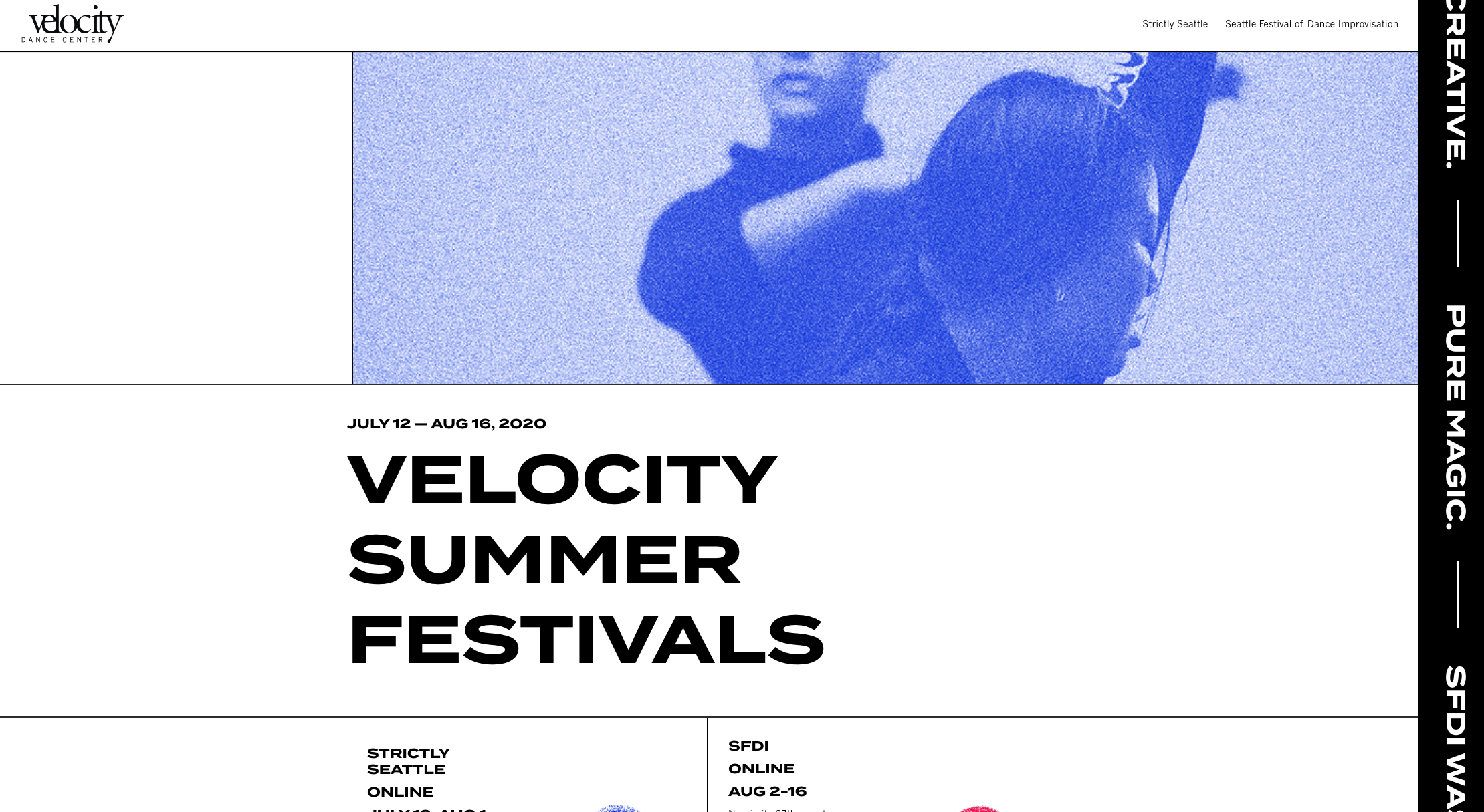
Along with leaving larger areas of white space, some designers have started highlighting the fact that websites are built on a grid. The use of visible grid lines and elements following the grid are becoming more commonplace.
Another easy and excellent way to incorporate minimalism in your website’s design is to use a simpler navigation bar or header. Using a hamburger icon to hide your navigation menu and the use of buttons to draw attention to your CTAs make it simple for users to navigate your site.
Big & Bold
Paired with the use of bold colors, other bold design choices are becoming common in 2020. Go big or go home. Incorporating oversized elements is a surefire way to cut straight to the chase and ensure your reader's don't miss the message. Companies that are looking to communicate more clearly and concisely have opted to use typography alone, especially in headers where important information is located. This can help to attract users to buy in right away.
Other elements that are becoming oversized in web design include photos and graphics like icons. The idea is that the bigger the element, the more eye-catching it will be which helps the user better understand what the company is offering, faster.
The Work and Life of Stanley Kubrick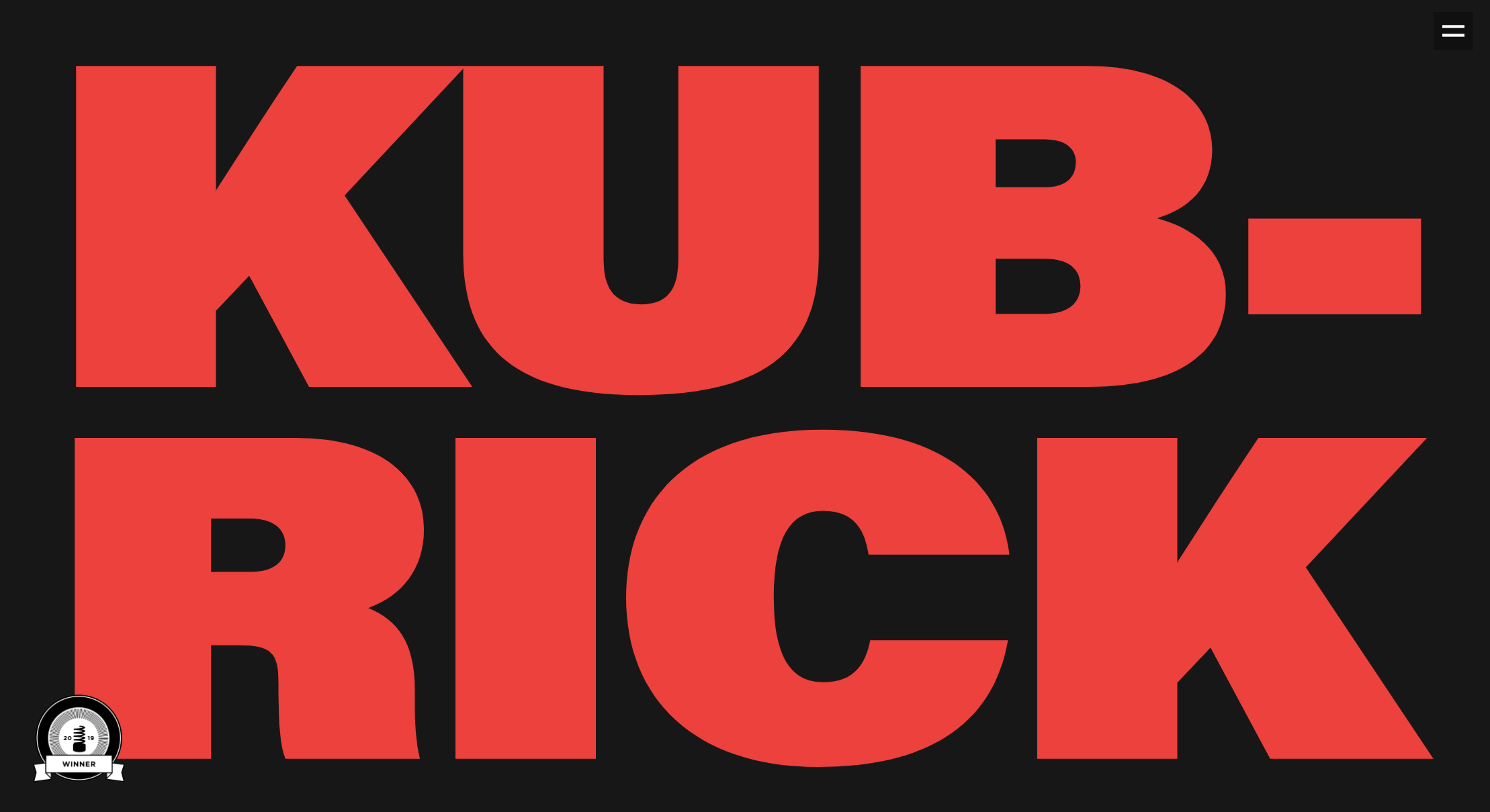
Chiara Luzzana: Sound Designer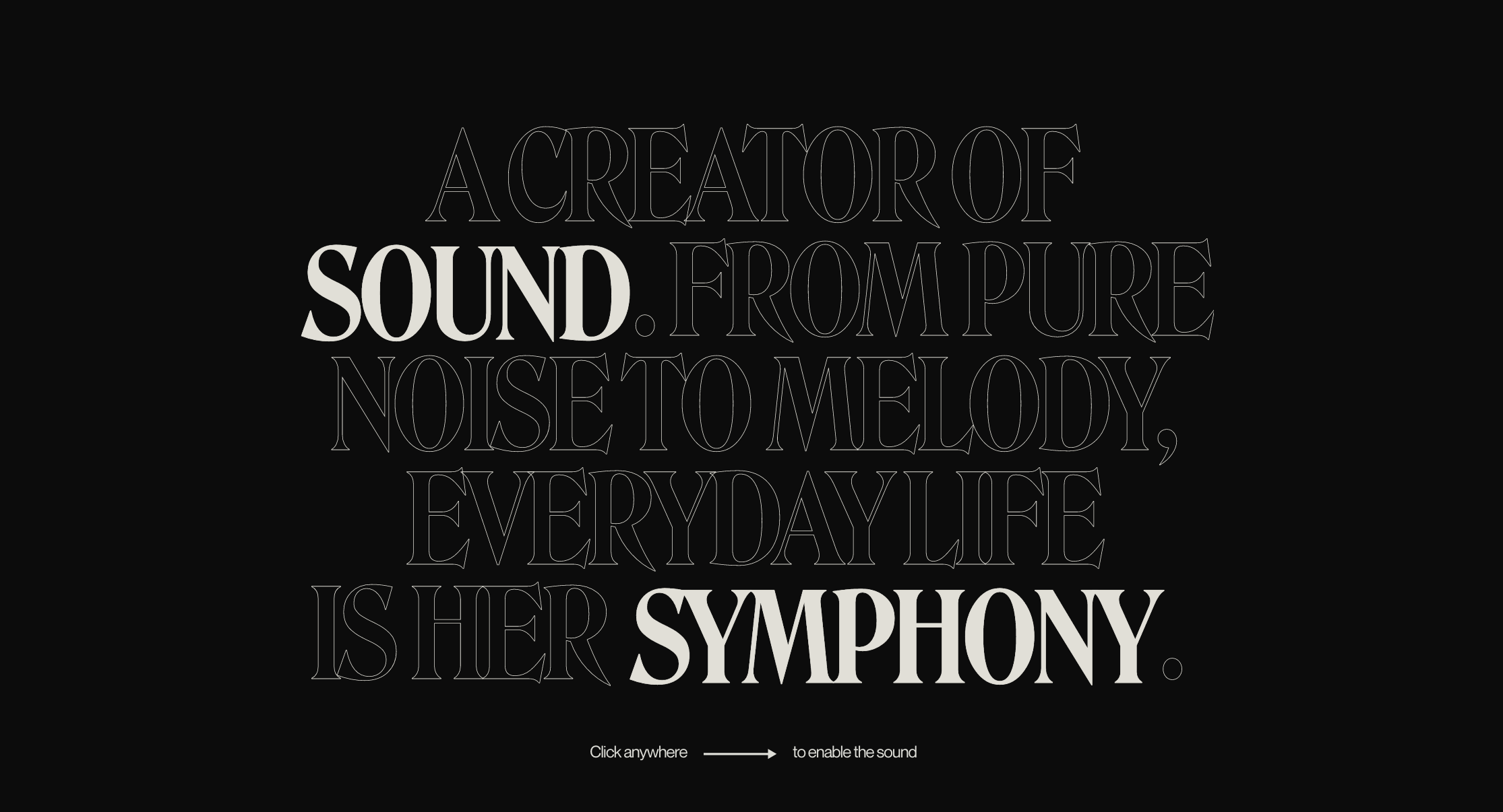
Creating Depth
With the rise in popularity of minimalistic websites, designers have learned to incorporate elements that still bring interest to the design. Layering, floating, overlapping — there's a myriad of methods to creating interest on the page with your design elements.
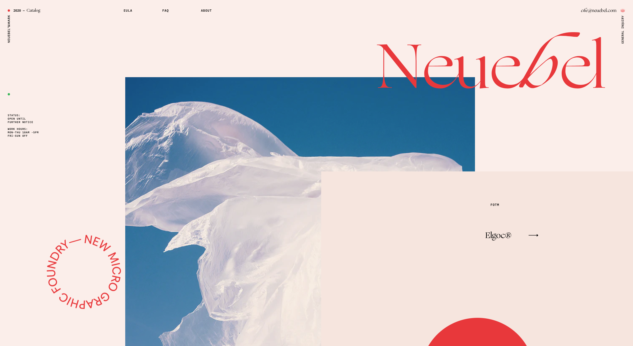
Overlapping photos with graphics and text tricks the eye into seeing the photo as the background element. Floating elements with subtle shadows can also have this effect and create depth. Modern geometric shapes have become widely popular and can be incorporated to overlap with other elements as well. By using these techniques, designers are creating bold designs that stand out even in a minimalistic website.
Custom & Quirky
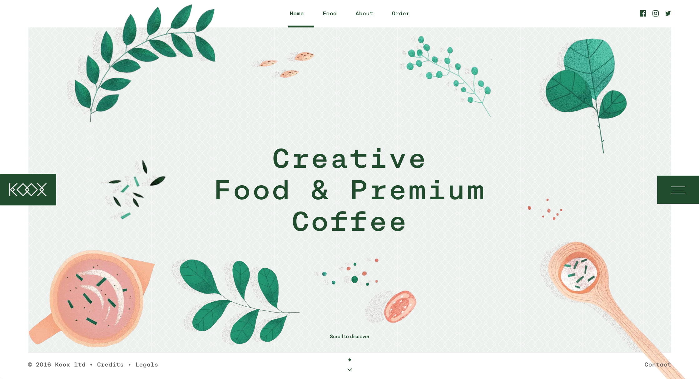
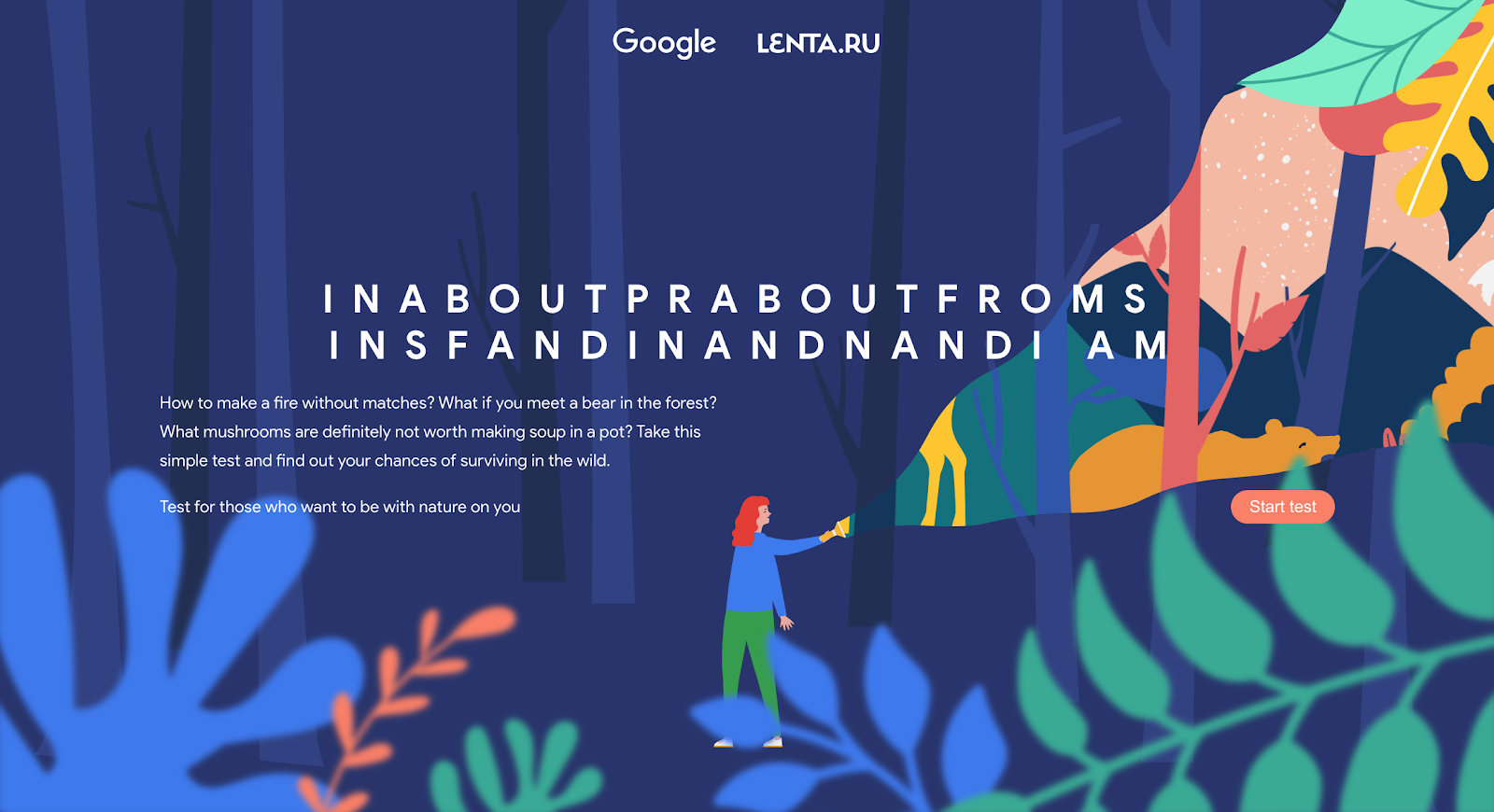
Tired of seeing the same old stock photos across the web? Web designers agree with you and are using a new trend to combat that: quirky, hand-drawn illustrations. Show the people behind your brand with hand-drawn illustrations and imperfect shapes. A stray from the perfect and sleek allows your users a warmer web experience. It’s refreshing to see imperfect elements incorporated into websites, especially for users bored of the sleek, perfect designs that dominate the majority of the internet.
But you don’t ONLY have to include illustrations! Photos can still be used and have hand-drawn elements incorporated into or over the top of them. This is aesthetically pleasing and oozes the quirkiness that can attract a younger audience or those looking for a company with a little soul.
Creating custom illustrations will always make your website feel fresh because no other site will have the same look. This is great for branding and will go a long way in making your company stand out.
Animations, 3D, & Interactive
3D visuals have been around for awhile, but the technology and the expense of producing them hasn’t quite caught up until now. Connection speed and bandwidth were major deterrents for designers as well as the training needed to create these immersive designs. Nowadays new programs that don’t require years of experience to use have allowed more designers to incorporate 3D elements into their websites.
Animation has played an important role in website design for a while, but is evolving to become more interactive. Next level design is well and alive. Elements that formerly moved on their own accord can now be controlled by the user when clicked. Incorporating these 3D elements is a game-changer for the UX experience. That’s not to say that scrolling animated effects are gone for good. They too have evolved into what’s now called “scroll generated” motion graphics. This type of animation creates a seamless transition of moving, animated elements that evolve as the user scrolls down a page.
Reinvent, Redesign
It can seem overwhelming to keep up with the latest design trends when it comes to your website, but if you are following the principles of growth-driven design and updating your website according to user data, it shouldn’t be a stretch. With companies going head to head and competing for an audience, it’s well worth making a change in order to stand out in an overcrowded digital world. The latest 2020 website trends outlined here are a great starting point on the way to modernizing your web presence and will surely remain relevant in the years to come.
.webp?width=12693&height=4513&name=Sauce%20Logo%20Dark%20Ht%20(1).webp)

.webp?width=180&height=64&name=Sauce%20Logo%20Dark%20Ht%20(1).webp)

